Our Solution
In order to relaunch Autosupermarket, it was necessary to completely rethink the user experience and understand what the keys to becoming a top player in the market could be.
Logo restyling
The new logo is a modern and dynamic evolution of the original Autosupermarket magazine logo. It maintains a visual link to the past while representing the innovation and freshness of the new website.
The logo was redesigned with the idea of incorporating recognizable visual elements relevant to the automotive industry, with elements conveying a sense of reliability, quality and progress.
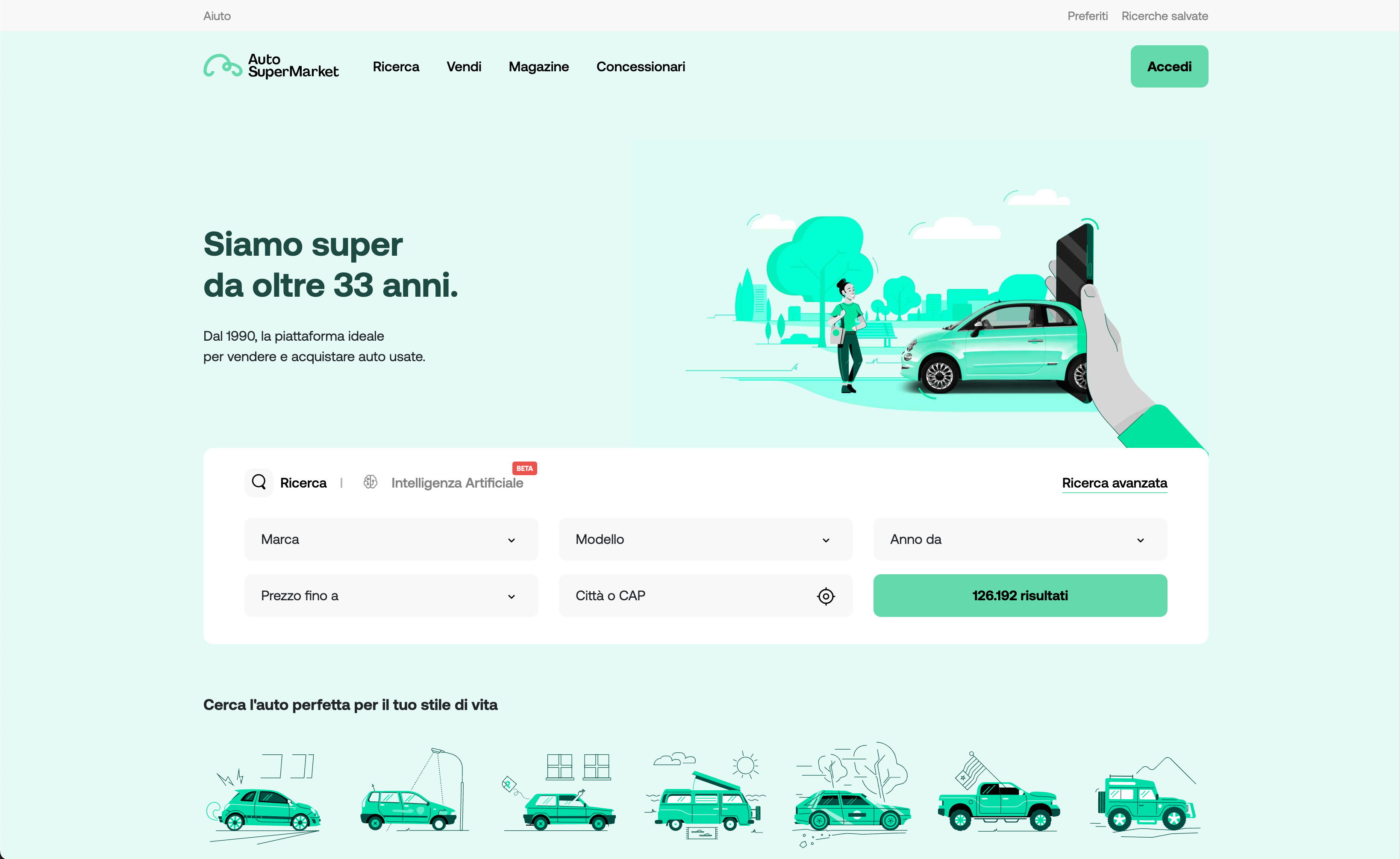
The new website
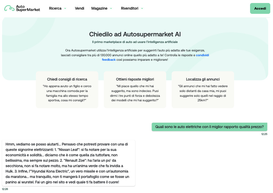
We have defined product functionality and user experience by trying to improve on the state of the art, introducing features that no other competitor uses, including conversational AI search and messaging features. These features make the buyer experience extremely simple.
We created a mobile first product with a contemporary and fresh design to attract a young target audience, which is increasingly difficult to intercept and retain.

Artificial intelligence
The development of a powerful artificial intelligence (AI) feature introduces a new level of assistance and interaction for users.
Thanks to AI, the system is able to understand the meaning and context of users' questions, analysing keywords, phrases and grammatical structures to extract the full meaning of the question, providing accurate and detailed answers.

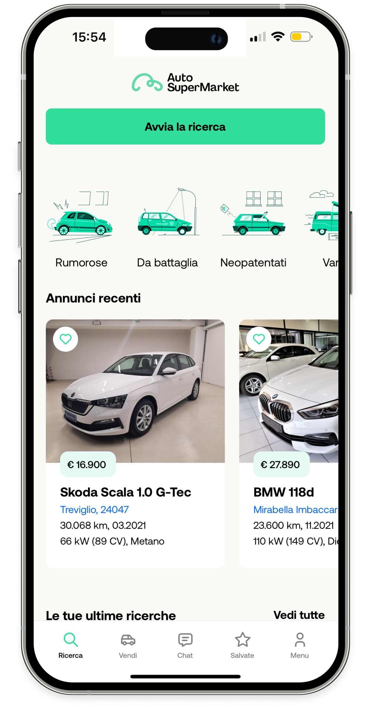
Mobile application
The application aims for quick and easy access to the many features and to benefit from the extensive advantages of the website directly from mobile devices.
The interface is designed with an intuitive and user-friendly design, clear organization of information, and easy access to different sections of the app.

